
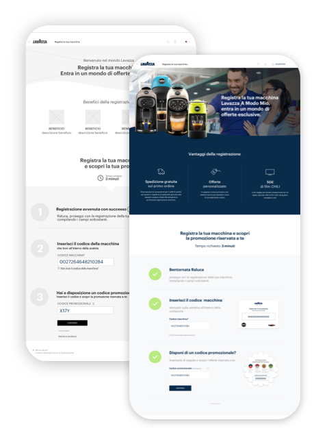
Delivering a high-quality machine registration experience for Lavazza users.
Year: 2019
Agency: VMLY&R
Client: Lavazza
Timing: 4 weeks
A guided step-by-step process to help customers register their coffee machine and discover related promotions.
The Problem
An analysis conducted on the Lavazza website showed that, in the last year, the machine registration percentage decreased by 45%.
To optimize the percentage, the business decided to incentivize the machine registration by offering a benefit as a reward, to engage the customer as much as possible. Therefore, we had four weeks to define a new machine registration flow and incorporate the business request.
The Impact
The new registration flow created resulted in a 74% increase in coffee machine registration and a 35% decrease in landing page drop-outs, which led to business satisfaction due to excellent results.
The Outcome
A refined machine registration strategy across both physical and digital channels, as well as a redesigned subscription landing page.
My Role
As UX Researcher and Manager, I worked closely with my team and the project managers, business and IT, to develop and deRne the best UX strategy considering user needs, business choices, and specific technical limitations.
I also help my team perform research activities such as field studies, analytics, and customer analysis to bring the user perspective into the project and build a helpful solution for him that could transition to future purchases and retention.
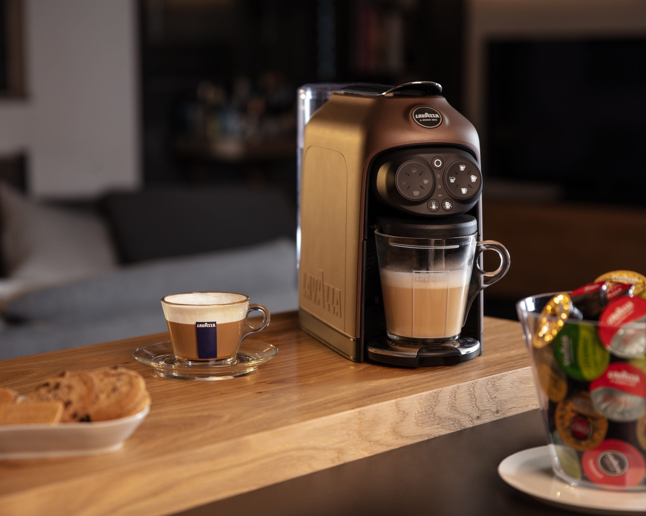
At the beginning of the project, we've known only that the machine registration was possible only through a private page, after a login/registration process. We observed that this page had a huge drop-down bounce and exit page. Without previous research and with no budget available, I planned the exploration and research activities to integrate and verify the actual flow and user behavior and habits.
User research analysis
Mapping research findings
Insight definition
IT collaboration
I performed several research activities that helped us understand better the context problem and what area areas needed to be improved.
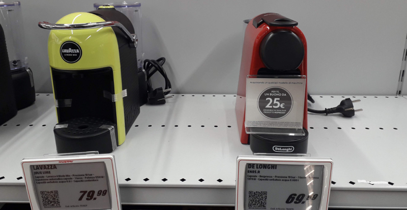
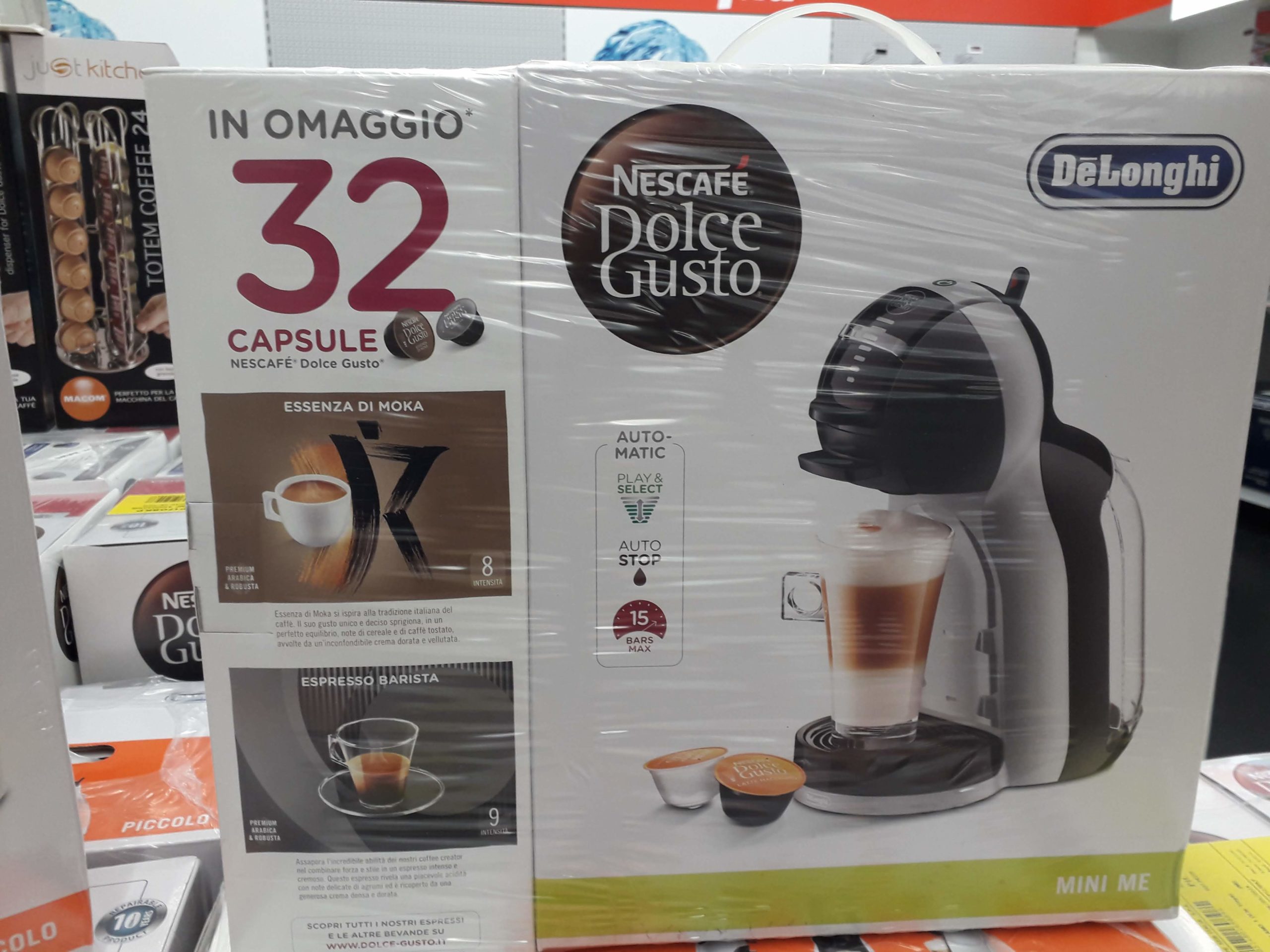
Direct observation
of people interested in buying a coffee machine in the shops, intending to understand how the brand and competitors communicate with customers.
Guerilla interviews
Fortunately, the VMLYR group was composed of a reasonably large number of people that love coffee, and this allowed me to do some guerilla research. I've found out directly from them what they are looking for in a Lavazza coffee machine's pack and which information is essential to be visible for them before proceeding with the acquisition.
Customer feedback analysis
provided by the Customer Service which detailed problems most often the users encounter and a vision of their habits and motivations.
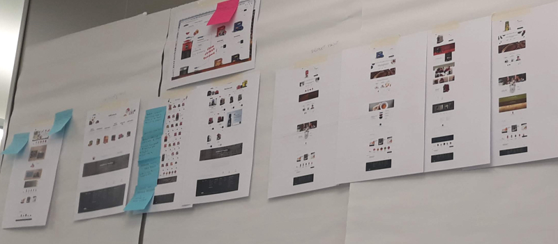
Some pictures taken during the filed studies
Competitive analysis
through functional benchmark aimed to map the product registration flow, the way the brands communicated, and the touchpoints they used.
Usability testing
I performed 6 usability tests on the current registration Sow to learn the obstacles that prevent registration, the challenges that users encounter, and intercept usability and accessibility pain points.
Analytics data analysis
to oversee and track the current registration Sow of the coffee machine, with a focus on the primary research metrics such as paths funnels, interaction click, multichannel funnels, entry pages, time on page, and the bounce rate on different pages.
Affinity diagrams
Task analyses
Prioritization of ideas
Design documentation
Stakeholder presentation
The research highlighted that 90% of the interviewees didn’t know that the coffee machine could be registered and, furthermore, that there was a benefit from its registration.
On the other hand, those who wanted to register the coffee machine couldn’t do it because the online registration page was private. Therefore, its content was available only if they first logged in or registered to the site.
After we collected all data, we did a thematic analysis that generated three main How Might We statements, based on which we reframe the challenge and set priorities and clear guidelines for the ideation phase.
HOW MIGHT WE
increase discoverability and inform the user about the machine registration benefits?
We insert the registration communications on the two main touchpoints we could intervene in: the coffee machine pack directly on the packaging and the email, for those who purchased it online.
HOW MIGHT WE
offer confidence and credibility to the user and a personalized experience?
A critical issue was that the actual registration page was private, and it was possible to see its content right after the site login or registration. We "unlock" the machine registration page by making it public and no longer private and we change the actual page structure presenting to the user all the benefits of the registration. We also design a form to guide the user through each step of the registration, explaining what it has to do and where to find the information required to complete the registration.
HOW MIGHT WE
Guide the consumer through each step and create a quick-engaging registration process?
The insertion of the machine code occurred after too many clicks and different pages. To facilitate the user experience, we simplify the machine registration steps by decreasing the steps to achieve the user's goal and at the same time, reduce system errors and form filling as much as possible.

Affinity diagrams
Task analyses
Prioritization of ideas
Design documentation
Stakeholder presentation
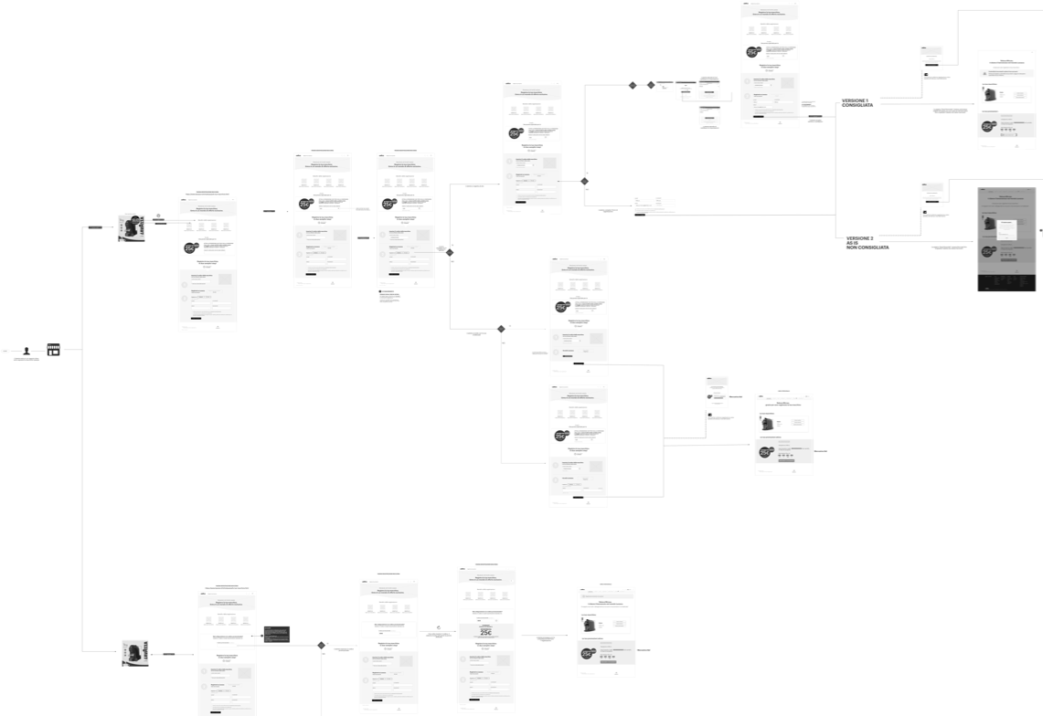
Choose the right design elements that best meet the needs of users with less IT impacts and map all the wireflows to ensure that the experience is smooth and frictionless.
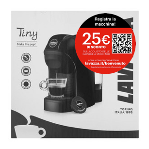
At this point, we've known what the next steps were to be done. Firstly, we had to understand how to communicate the benefit of the machine registration to increase discoverability and inform the users. Changing the packaging was not possible so we choose to add a sticker on the pack to do that.
Defining the benefit to show on the sticker
There were a lot of opinions regardless of what to show on the sticker: one idea was to show only the benefit and the other one was to also include the link of the registration and other details. With so many contrasting ideas, I decided to map out the use case flows for each type of sticker, pointing out the pros and cons for each of them.
I analyzed all types of call-to- action and user step-by-step experience.
We identified and discussed along with the business all the pros and cons for each sticker to decide the right variant to proceed.
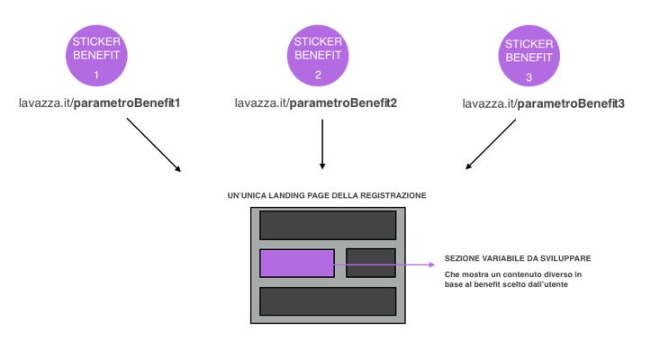
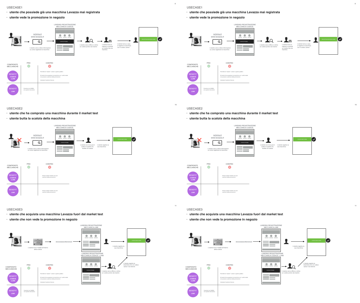
I created a document, presented and discussed it with the stakeholders and in the end, we choose the right variant of the sticker to proceed on.
With the chosen sticker, users were more informed about the registration of the coffee machine and moreover, they immediately acquired the communication of the benefit proposed to them.
Create the concept mapping of the pages
We changed the visibility of the registration page. We mapped out concepts like multilanguage options, explanatory and clear copytext of what to expect on the page, what are the benefits, and how to register the coffee machine, illustrating visually where to find different codes needed in the process.
We follow up the flow and modify also the pages related to registration inside the private area of the website, to keep consistency in the communication and inform the user on how to obtain its benefit after the registration.
Year: 2019
Agency: VMLY&R
Client: Lavazza
Timing: 4 weeks
Wireflows
Are you interested in working together? Get in touch!
Certified UX Specialist based in Milan, Italy Willing to relocate
Phone: +39 3664929604
Email: hello@ralucamircea.com
LinkedIn | Behance

©ralucamircea 2020 | Cookie Policy | Privacy Policy |
UX Strategist and Designer
Website built with Semplice